THE NUMBER THAT LIED
05-05-2021
“There is a tsunami of data that is crashing onto the beaches of the civilized world. [...] As it washes up on our beaches, we see people in suits and ties skipping along the shoreline, men, and women in fine shirts and blouses dressed for business. ” Richard Saul Wurman
From diagnostic to treatment, data is blended into the remedy to the burning challenges of our contemporary societies.
A Latin term for information, data has long been crucial to the development of economies. The first occurrence of data visualization trails back to Ramesses IV’s expedition into the Eastern Desert. The pharaoh’s itinerary was outlined from the Turin Papyrus, a map detailing the dry river beds of Wadi Hammamat and the resources’ distribution of the Arabian-Nubian Shield.
The information revolution propelled by technological innovations poised data’s unquestioned relevance. Tech Giants such as Facebook wound the thread of their success around the notion that numbers do not fail and, as such, were to be the underpinning of decision-making.
During the Second World War, Data-driven decision-making came into full speed in the United States when the Pentagon founded the Statistical Control Team. By augmenting the efficiency of war administration, it is said to have saved the American economy $3.6 billion. Yet, a mere decade past the end of the conflict, during the Vietnam War, data misled the U.S. Secretary of Defence. Robert McNamara, then-Secretary of Defence, felt that “he could comprehend what was happening on the ground only by staring at a spreadsheet” (Cukier, Mayer-Schönberger, 2013). “The best and the brightest”, as nicknamed by the New York Times, believed that state affairs were to be guided by the strict consideration of data. A singular focus on data clouded his assessment of the situation and prevented him from giving due attention to lurking variables such as the experience of a complex battlefield, and the knowledge of the enemy. Data deceived him, as it can mislead us. Misleading data ought to be at the forefront, in a context of a pandemic where governments’ responses were supported, justified, by assembling of data - numbers of incidence, numbers of cases in intensive care units, percentages of vaccinated population …
The Collection of data
Before processing data, interested parties must select a sample from which they will extract information. The initial process is key to any scientific endeavor. Errors may weave themselves into the fabric of data collection, hindering all stages to come. The sample selected can be too small, or not diverse enough. Considering a population, if the parent sample is too small, social groups may be misrepresented, resulting in faulty technologies, discriminatory policies, incomplete decisions. An instance of the phenomenon is the racial biases of face recognition technologies, furthermore, the infamous occurrence of Nikon photo cameras showing a ‘blink warning’ when Asian individuals were photographed is a solid argument for mistrust in data. Discriminatory data is a key challenge for equality. Building a more equitable data landscape requires critically assessing the quality of data samples. Selective biases, intended or not, must be identified in the early stages of the process. Selective biases may result in data omission or adjustment. Some research methodologies are more porous to data manipulations. For instance, a poll’s questions, when persuasive, condition the answer. Likewise, surveys are not infallible, an interested party running an advocacy campaign for the lowering of the driving age can mislead data by solely querying younger generations.
The Processing of data
A tenet of the scientific method is the hypothesis. The analysis of data is meant to confirm, or infirm such hypothesis. Processing gathered information, data scientists risk tumbling into many traps, impacting the fate of the hypothesis.
The first one is uncovered by Mark Liddell, in an educational short for TED. In a Simpson Paradox, a single set of data supports opposing hypotheses. A lurking, unidentified, or omitted variable leads to such an oddity.
Confirmation bias is a second one. When interested parties are convinced of their hypothesis’ validity, or must confirm it, they may strictly consider data that will confirm conjecture.
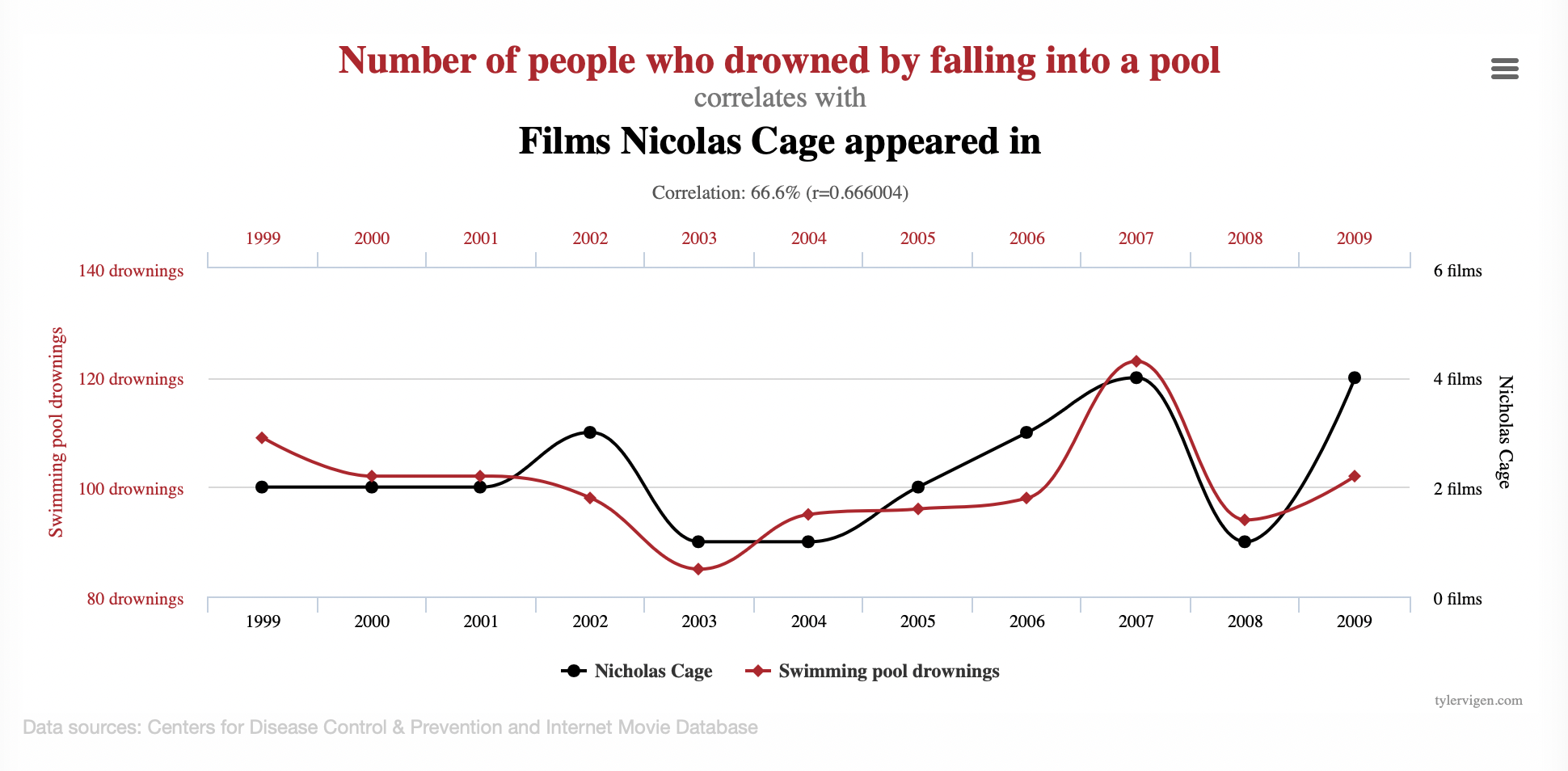
Lastly, the most common error is the confusion of correlation for causation. Comparing two sets of data, one may observe identical evolutions. A relation of causality is assumed: data A causes data B. Yet, a phenomenon is often due to an ensemble of factors and variables. When tested, faulty causation is often discarded. In Spurious Correlation, Tyler Vigen creates graphs combining unrelated data set with remarkable similarity, creating the illusion of causation.
Data Visualization
Data Visualization is a creative exercise of translation assuming the audience’s visual literacy. Visuals pack a punch, they are efficient in making straightforward arguments, swiftly acknowledged, easily remembered. A faulty vehicle of transmission can explain misleading data. It can reinforce preconceived notions, with colors, shapes, icons, before the data is read. Identical data can appear strategically different in a pie chart, a graph, a table, a map.
Considering graphics, an interested party willing to manipulate results may do so by tweaking the scale or Y-axis ‘ starting value. A modified scale exacerbates or condenses an evolution, artificially generating exponential growths or collapses. Selecting Y-axis ‘ starting value impacts the perception of the evolution by truncating the graphic. Manipulated pie charts present unjustified perspectives or 3D effects.
Misleading data may not betray malevolence. Nonetheless, it will be a threat as long as data benefits from the benevolent prejudice of legitimacy, unchallenged.
The devil is in the detail. Dealing with data, institutions and private actors must be transparent about their approach, from collection to visualization. Investing in digital literacy and visual literacy training in formal and non-formal education is crucial to assembling communities of trusting, alert citizens.
Additional Resources
Quarz, The Quartz Guide to Bad Data
NAJIBI A., Racial discrimination in face recognition technology, Harvard University, 2020
PATER R., The Politics of Design, BIS, 2016
RENDGEN S., Information Graphics, Taschen, 2019